“I’m not an idiot,” artist Paul Robertson has admitted in an interview. “I know that people are mostly interested in it because it’s David Bowie. But I think it’s still a valid artwork.”
As part of the 2013 David Bowie is exhibition at London’s Victoria & Albert museum, Robertson created the below artwork; The Periodic Table of Bowie.
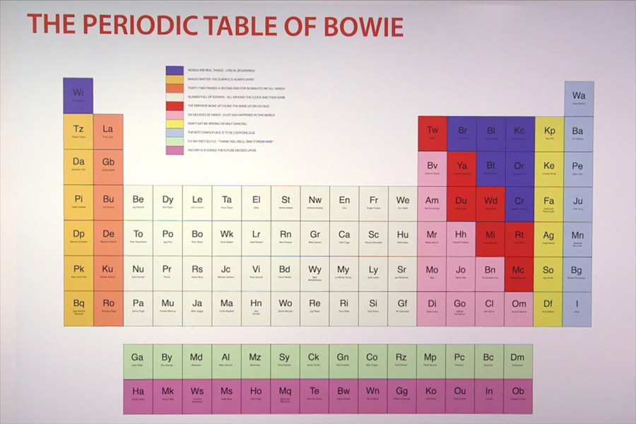
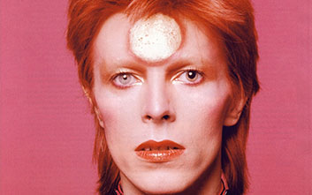
Have you ever wondered about all the places the Starman draws his influence? Check out The Periodic Table of Bowie from artist Paul Robertson.
Like the actual periodic table, Robertson’s take separates influence into ten different categorisations defined by colour:
- Purple: Words Are Real Things – Lyrical Beginnings
- Dark Yellow: Images Matter – The Surface is Always Shiny
- Orange: Thirty-Two Frames a Second and for 90 Minutes We All Vanish
- Cream: Islands Full of Sounds – All Around the Clock and then Some
- Red: The Emperor Woke Up Found the Make Up on his Face
- Pink: Six Decades of Grace – A Lot has Happened in this World
- Yellow: Don’t Get Me Wrong I’m Only Dancing
- Light Blue: The Best Camouflage is to Be Everyone Else
- Green: Fly My Pretties Fly. “Thank You, We’ll Take it From Here”
- Purple: History is a Choice the Future Decides Upon
A hi-res version seems quite hard to come by, but you can buy a print of the table here. Check out a video on the artwork below:
Via Open Culture.